
Skyline Robotics
Product Design
OVERVIEW
Skyline Robotics builds autonomous robots for window-cleaning skyscrapers.
While the hardware was groundbreaking, the company lacked a dedicated
data product for its clients.
My Goal was Build a SaaS data platform from scratch to transform raw
engineering logs into a functional, insight-driven tool for cleaning company owners.
MY ROLE
As the sole product designer, I defined the product structure, mapped flows, and designed both interfaces to transform complex data and messy screens into usable,insight-driven tools.
I collaborated closely with engineers to align technical constraints with user needs, while also driving UX research, information architecture, and visual design.
CHALLENGE
The Visibility Gap
When I joined, the "data" only existed in internal engineering logs. Clients (cleaning company owners) who invested in the technology had no way to track progress or verify work.
The Problem was High-tech hardware with zero user-facing transparency.
Robot Data Dashboard - From Scratch to MVP
Skyline Robotics needed a fast, usable, and modern data platform to support their window-cleaning robots.
I was brought in to turn rough wireframes into a real product - designed from scratch for
non-technical users, on a tight deadline.
Initial Requirements

40+
Adapted for users across varying age groups and levels of tech proficiency


Give it a sleek, fresh look that reflects the innovation of the robot itself

Maintain brand style and color

Deliver a working first version in just 4 months for clients and investors
Key Personas
I defined two core personas based on internal insights and team input.

David Martinez
39
Building Maintenance Manager
“ I’m juggling five buildings. I just want to know where we’re
at, and if I need to step in...
Tech Level:
Moderate
Employees:
25
Company Regions:
Miami, USA
Needs to
See real-time robot activity across sites
Know when a cycle is done or paused
Catch issues before tenants complain
Coordinate between crews and robot timelines
Wants
Clear view of which facade is being cleaned
Visual alerts for errors or maintenance
Easy-to-access reports for each day
No learning curve - just works

Mike Thompson
50
Company Owner
"My job is to keep things moving. A simple dashboard helps me stay ahead of problems..
Tech Level:
Basic
Employees:
1,080
Company Regions:
LA, USU
Needs to
Track cleaning progress without calling the crew
Get alerts if a robot stops or delays
Prove work was done for client reports
Monitor cleaning costs across buildings
Wants
Simple visual summary per building
Status per robot and facade
Monthly cost breakdown to compare
building performance
Reliable, low-maintenance system
Setting the Tone
The login screen is the user's first point of contact with the product, so I explored different directions to
reflect the robot’s scale and precision. I used AI-generated imagery to support the product’s identity and introduce a visual language early in the experience.


Original Brief
I received an initial screen created by the engineering team- it included basic layout suggestions and general functionality requirements, but left room for interpretation.
I used it as a starting point to define user needs, clarify flows, and introduce distinctions between different user types- turning the raw concept into a structured and usable experience.


User Flow
Before jumping into UI, I needed to clarify how users actually
navigate the system.
I mapped out the core user flows based on the product logic, distinguishing between company owners and building owners.
This helped me define what each user should see, when, and why -and ensured that the final interface would match real-world needs.
From Rough Outline to Functional Flow
Based on the user flow, I designed the key screens that guide building owners through monitoring, navigation, and issue detection - while keeping the layout scalable, readable, and easy to act on.

.png)


.png)
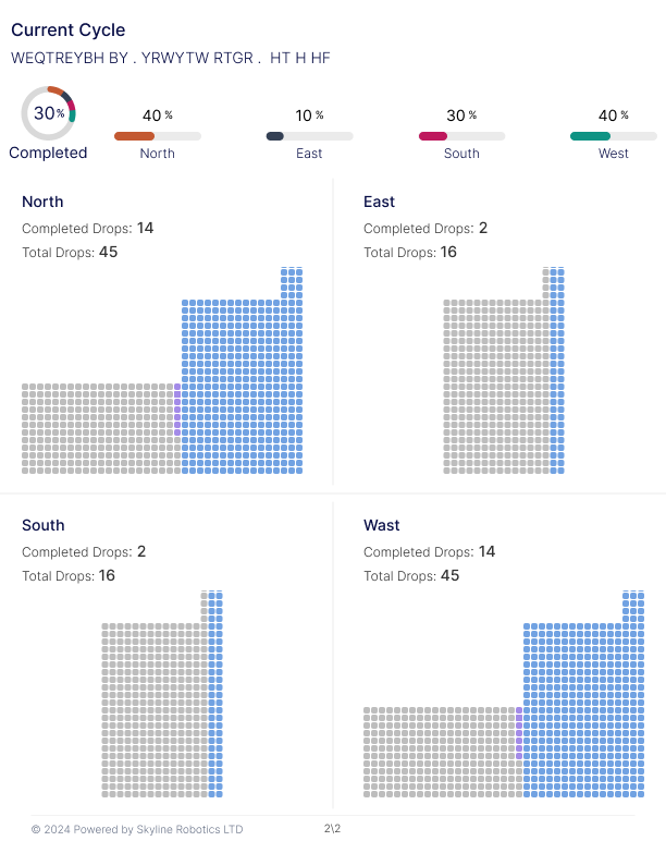
Building Dashboard
Displays real-time robot progress on the building facade.
Users can switch between facades (North, East, etc.) to view cleaning status per side. The visual grid shows drop-by-drop completion, with clear indicators for progress and current activity. A side panel provides operator logs, historical activity, and total drop counts.
.png)
.png)
Cleaning Trends
I designed a dashboard that gives building owners and customer a quick, data-rich view of cleaning progress and resource usage. The layout allows users to drill down per building and compare key metrics - from drops completed to power and water consumption - all in one place.
All reports in one place
A centralized table that allows users to search, sort, and access reports by organization, building, or cycle. Once a report is selected, users can view all cleaning activity for that specific cycle -
with clear daily breakdowns, totals, and operator details.
.png)
.png)
For sharing and documentation needs, I also created a downloadable PDF version of each report, designed to reflect the same structure and clarity as the in-app view.

Design-to-Dev Handoff
For each custom widget in the system, I prepared a dedicated spec to support the dev team-covering layout, spacing, states, and behavior. This helped ensure consistent implementation across screens and reduced back-and-forth during development.
.png)


Title Text
Subheading text
Body text Body text Body text Body text
Body text Body text Body text Body text
Body text Body text Body text Body text
Body text Body text Body text Body text
Font Name:
Inter
We chose the "inter" font for its excellent legibility and professional aesthetic, ideal for presenting extensive graphs and data in the product.
Inter Light
Inter Mediom
Inter Bold


