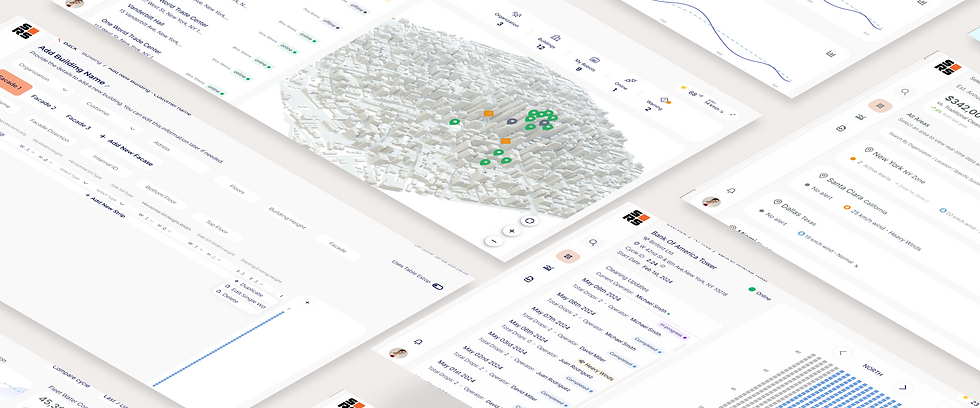
Skyline Robotics
B2B SaaS Platform for Robotic Window Cleaning Operations
Skyline Robotics builds autonomous robots for window-cleaning skyscrapers.
While the hardware was groundbreaking, the company lacked a dedicated data product for its clients.
My Goal was Build a SaaS data platform from scratch to transform raw
engineering logs into a functional, insight-driven tool for cleaning company owners.
PROJECT OVERVIEW
Role
Solo Product Designer
Timeline
2024 - 2026
Team
1 Designer, 4 Engineers
Platforms
Web Dashboard

THE CHALLENGE
Problem
Lacking an interface, stakeholders were 'blind' to operations, hindering oversight and granular control.
While robots cleaned buildings across the city, stakeholders remained 'operationally blind' in the office. Without a high-level view of the fleet, they couldn't detect performance deviations or provide the 'Proof of Work' needed to justify robotics over manual labor.
PAIN POINTS
No "big picture" view of fleet activity, leading to total reliance on verbal reports.
Inability to detect recurring issues or deviations from the cleaning schedule.
No data-driven evidence to prove the robots' efficiency compared to manual labor.
Critical business data was trapped in engineering logs, inaccessible to decision-makers.

SUCCESS CRITERIA
Rapid Fleet Adoption
Verified Business ROI
Reduced Support Overhead
Lower Operational Risk
Self-Serve Insights
Solution
A hierarchical platform transforming real-time data into strategic oversight and direct field control.
A unified platform that gives stakeholders a single source of truth. It answers the three most critical questions: Is the fleet working? Are there recurring issues? And is the investment paying off? while providing managers with the real-time control to keep daily operations on schedule.
KEY FEATURES
Real-time Fleet Status: Instant visibility across all global assets.
Recurring Trend Analysis: Identifying systematic issues before they escalate.
Automated Value Metrics: Live tracking of savings and operational efficiency.
Deep-Dive Hierarchy: Seamless transition from city view to a single robot.

Oversee
A unified hub providing real-time fleet visibility
Unified fleet pulse • Live status indicators • Global asset tracking
.png)

.png)
.png)
.png)
Respond
Proactive alerts for performance deviations and risks.
Smart deviation alerts • Risk-based notifications • Immediate action triggers
Validate
Financial metrics to verify ROI and labor efficiency
Automated ROI tracking • Labor efficiency metrics • Cost vs. savings audit
.png)
.png)
.png)


Explore
Granular drill-down from fleet overview to window-level.Explore
Spatial drill-down • Granular unit diagnostics • Multi-level navigation
Entry Point
Global Fleet Overview
Owner KPI View • High-level business metrics
NYC Map & Building List
Filter by region • Spatial context
Regional
Window-by-Window Progress
Operational view • Real-time data
Building Detail
Analytics & Fleet KPIs
Operational KPIs • Resource Trends
Management
INFORMATION ARCHITECTURE
Defining System Flows: Bridging User Needs through Information Architecture
To bridge the gap between Mike's high-level business needs and David's granular operational requirements, I designed a 4-level drill-down architecture. This flow ensures that data is never overwhelming; it moves logically from a Global Fleet Overview (Level 1) down to a specific Window-Level status (Level 4). This structure transformed fragmented engineering logs into a coherent, actionable tool for all stakeholders.
PERSONA: BUSINESS STAKEHOLDER
LEVEL 1 • ENTRY POINT
Global Fleet Overview
High-level business metrics
LEVEL 2 • REGIONAL
NYC Regional Map & Building List
3D map view • Status-coded building list
PERSONA: OPS MANAGER
Technical
Anomaly?
YES
NO
LEVEL 4 • OPERATIONAL
Analytics & Fleet Overview
xx
Operational KPIs • Resource Trends • Reports
FINAL OUTPUT
Export Data / Download Completion Report
Stakeholder reporting • Client deliverables
DESIGN IMPACT
Bridging the Gap
This drill-down architecture
transformed fragmented
engineering logs into a
coherent, actionable tool
LEVEL 3 • GRANULAR DETAIL
Building Deep-Dive
Operational command center
• Real-time progress grid (window-by-window status)
• Weather/Wind monitoring (integrated environmental data)
• Facade switching (North, South, East, West views)
OVERVIEW AREA
Global Fleet Overview
High-level dashboard showing total robots across cities with resource-saving KPIs prominently displayed at the top. Designed for executive-level visibility.
.png)
Performance Trends
Historical data visualization showing efficiency improvements over time.
City Distribution
Visual breakdown of fleet distribution across global locations with status indicators.
KPI Cards
Total robots, active jobs, and resource savings highlighted for immediate business value assessment.
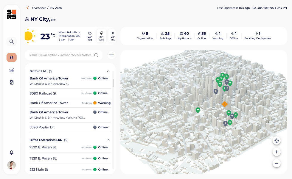
Regional Drill-Down (NYC)
OVERVIEW SPECIFIC AREA
3D map provides spatial context while building list shows status-based color coding (Online/Issue). Integrated weather/wind widget eliminates app-switching for operators.
.png)


3D Map Navigation: Visual Asset Sync
THE CHALLENGE
While a 3D map was a core requirement, navigating a dense urban environment with dozens of identical-looking buildings proved difficult.. This led to cognitive load and user disorientation during high-pressure operational tasks.
THE SOLUTION
I designed a visual "bridge" between the technical data and the map.. Selecting a building from the list instantly highlights its 3D model in Amber (#FFB000), allowing for immediate spatial recognition and zero search time.
TECH NOTE
Reduces time-to-action by 40% in critical warning scenarios.
FEATURE SPOTLIGHT
Weather Widget
Integrated environmental data showing temperature, wind speed, and operational safety thresholds.
Status Indicators
Color-coded building list with Online (green), Warning (yellow), and Issue (red) states.
Building Deep-Dive
SINGLE BUILDING
Window-grid interface showing real-time progress (e.g., 152/200 windows cleaned). Includes facade switching and historic cycle data for detailed operational insight.
.png)
Historic Cycles
Timeline view showing past cleaning cycles and completion rates for performance tracking.
Facade Switching
Toggle between North, South, East, and West facades to monitor multi-sided operations.
Window Grid
Visual grid representation of building facade with real-time cleaning status per window.
Granular Analytics & Anomaly Detection
This screen demonstrates the transition from global fleet data to a single-building drill-down view. Real-time KPIs, anomaly detection, and progress tracking converge to give managers instant situational awareness.
ANALYTICS
.png)
Granular Fleet Management
Enabling a 'Macro to Micro' workflow where managers can transition from a high-level fleet overview to specific building analysis (e.g., Bank of America Tower).
Deep-dive: Real-time localized data filtering
Business Value KPIs
Top-level cards display Estimated Annual Savings ($342,000) and Operational Hours Saved (2,500 h) with year-over-year growth indicators.
vs. Traditional Cleaning: 8% improvement
Progress Tracking
'Completed Drop' widget shows 152/200 (76%) progress with daily average metrics for immediate situational awareness.
Total vs. Daily Avg visualization
Trend analysis over time
Performance Benchmarking
Comparative visualization of current resource consumption against historical averages to ensure operational consistency.
Identifying resource usage spikes
Real-time threshold monitoring
REPORTS
Operational Analytics
Data cards for water consumption with anomaly detection and completed drop statistics. Designed for sustainability reporting and operational efficiency analysis.
.png)
Performance Scores
Automated scoring system comparing actual vs. expected performance per building.
Completed Drops
Historical data showing total operations completed with efficiency metrics.
Water Consumption
Real-time monitoring with anomaly detection alerts for abnormal usage patterns.
Setting the Tone: Facade Analytics
The entry point to the platform emphasizes data accessibility. The branding and illustration highlight our core mission: providing clarity and visibility beyond the traditional four walls of building management.
LOGIN
.png)
Minimalist UX
Streamlined authentication flow removes friction while maintaining enterprise security standards.
Visual Metaphor
AI-generated illustration communicates the platform's mission: data visibility beyond traditional boundaries.
Brand Identity
Clean Skyline Robotics branding establishes trust and professionalism from first interaction.
Let’s Talk
I’m currently seeking my next full-time challenge where I can solve complex problems and grow alongside a talented team.
GET IN TOUCH
Key Learnings
Dual Persona Design
Serving both operational detail (David) and executive overview (Mike) required flexible drill-down architecture.
System Standardization
A modular design system allowed the platform to scale its data architecture even while the product was in rapid MVP stages.
Visibility First
Prioritizing "What is happening now" over historical analysis was the key to user adoption.
Operational Efficiency
Integrating weather and wind data directly into the map reduced decision-making time significantly.
DATA VISIBILITY
0 to 100%
Transitioned from raw engineering logs to a unified, real-time operational dashboard
SUPPORT TICKET
-50%
Reduced engineering dependency, resulting in a 50% decrease in technical support tickets.
FLEET ACCESSIBILITY
100%
Fleet managers can now monitor all global assets without technical engineering knowledge.
RESULTS

